WFO SaaS solution for call centers
Client
Five9
Duration
2 years
Category
SaaS Design
Client
Five9
Duration
2 years
Category
SaaS Design
Client
Five9
Duration
2 years
Category
SaaS Design
What is Five9?
Five9 is a cloud-based software company that provides contact center solutions for businesses of all sizes. The company's software platform allows businesses to manage customer interactions across multiple channels, including voice, email, chat, and social media.
Five9's contact center software includes features such as automatic call distribution, interactive voice response, workforce management, and analytics tools to help businesses improve customer engagement and drive better outcomes. The company's solutions can be customized to meet the specific needs of different industries, including healthcare, financial services, and retail.
Problem statement:
The existing WFO cloud software at Five9 was outdated and lacked a cohesive user experience. It presented several challenges that hindered usability, productivity, and customer satisfaction. The main problems identified were as follows:
Outdated Styling: The software lacked a unified visual identity and did not adhere to any design system, resulting in inconsistencies across different components and workflows. This inconsistency made the software appear unprofessional and confusing to users.
Inefficient Workflows: The existing workflows were not optimized for efficiency and user productivity. They lacked logical sequences and intuitive interactions, leading to confusion and extra steps for users. As a result, users found it difficult to navigate through the software and accomplish their tasks effectively.
Lack of Updated UI Patterns: The software did not incorporate the latest UI patterns and best practices. This omission hindered user engagement and limited the potential for a modern and intuitive user experience. It also prevented the software from keeping pace with industry standards and user expectations.
Limited Solution Flexibility: The existing WFO software lacked flexibility in meeting the diverse needs of different organizations and industries. It failed to provide customizable options and lacked scalability to accommodate varying workflows and business requirements. This limitation restricted its adoption and usability for a wider range of customers.
Need for New Solutions: With the evolving needs of contact centers and workforce optimization strategies, the software required innovative solutions to address emerging challenges. These solutions would involve designing new features, integrating advanced technologies, and introducing novel approaches to streamline workforce management and optimization.
Solution outline:
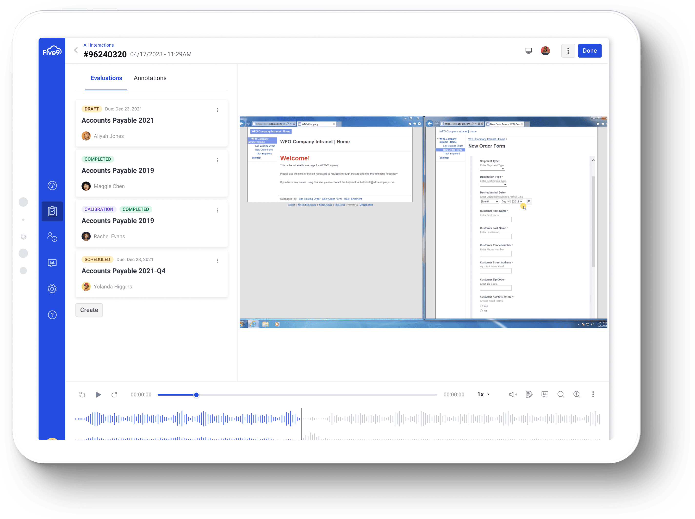
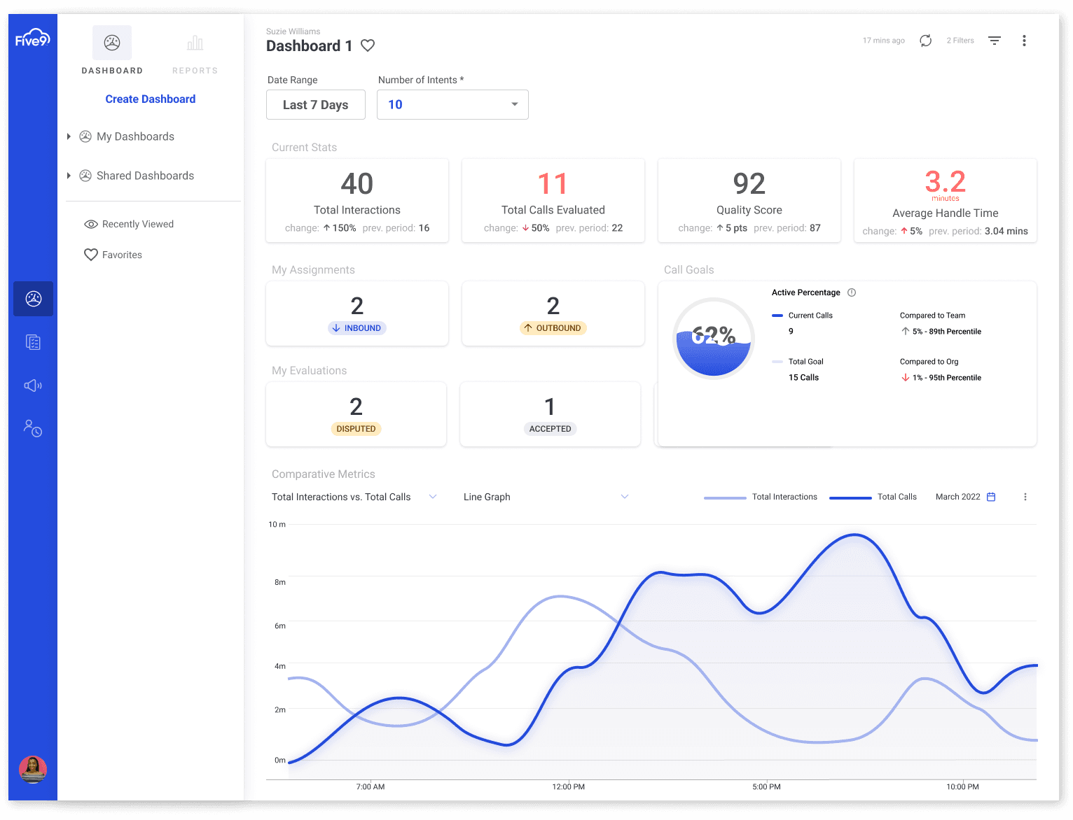
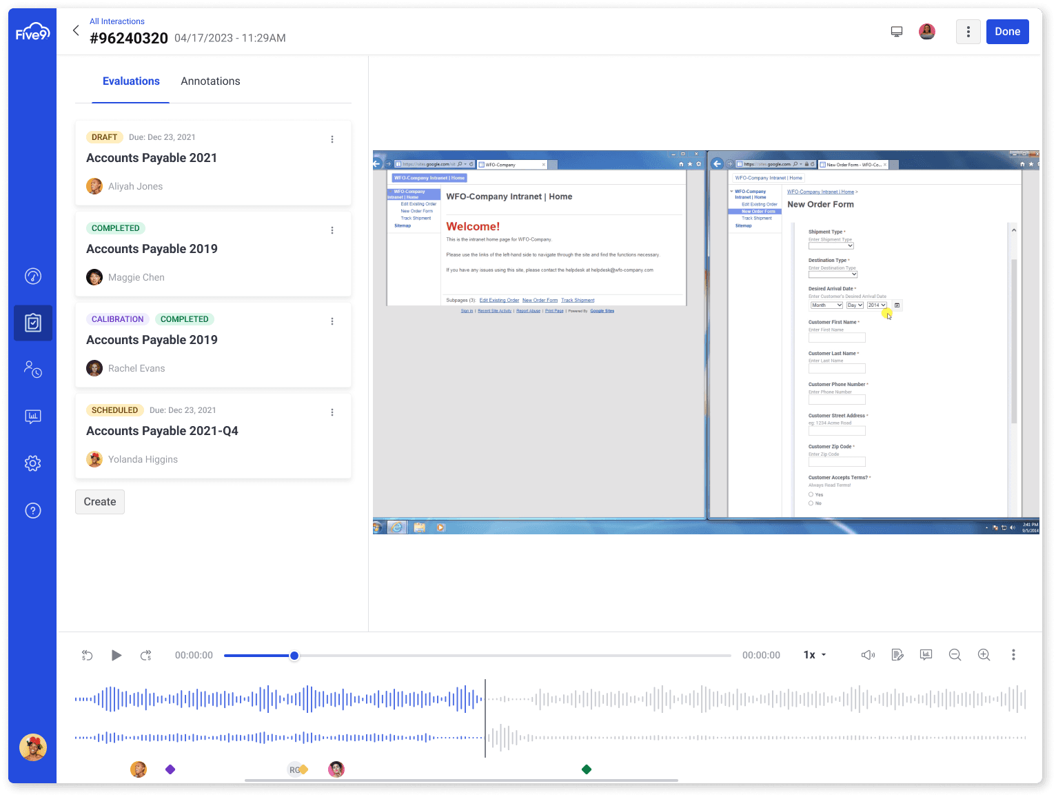
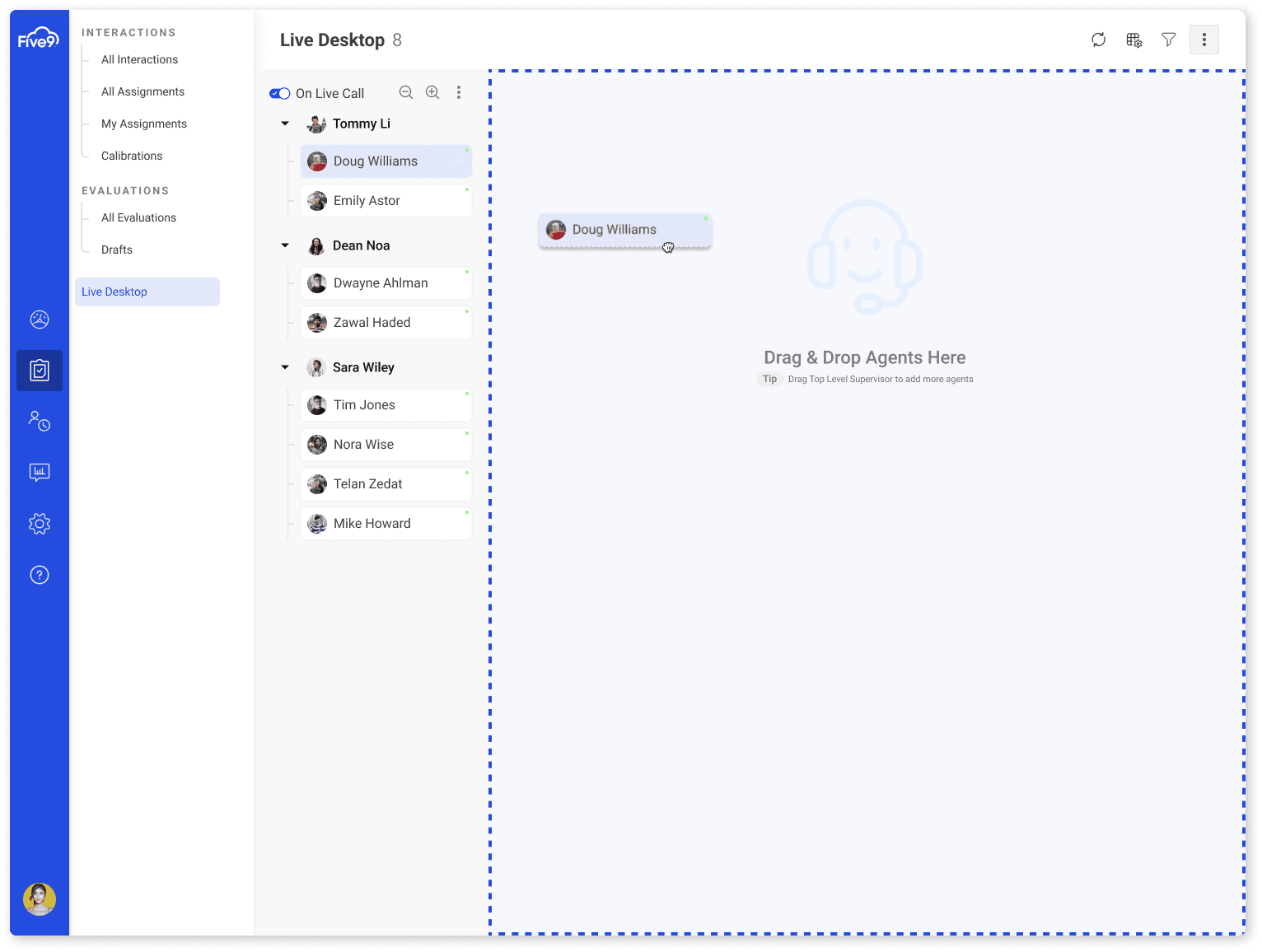
A modernized WFO cloud application that allows users to track the progress of their agents calls, monitor in real time the conversations being had with the agents in order to asssit them, and manage the Evaluation and Scoring process used to calibrate an agents performance with their peers. Additionally, the agents could also review their own progress with more detail.
Understanding the user:
I started by reading over the customer service tickets which were direct connections between the product owner and the customer. This helped me to better understand what struggles call center agents and managers face when dealing with evaluations for the performance of their agents - also the fragmented systems and tools currently being used made handling and reviewing interactions very cumbersome and hard to remember.
Research insight:
Some of the insights I gathered from my research:
Users would like more efficient worflows
Agents were complaining about the inconsistency in UI which they felt made the learning curve more difficult
Agents wanted a better way to handle disputes on their performance

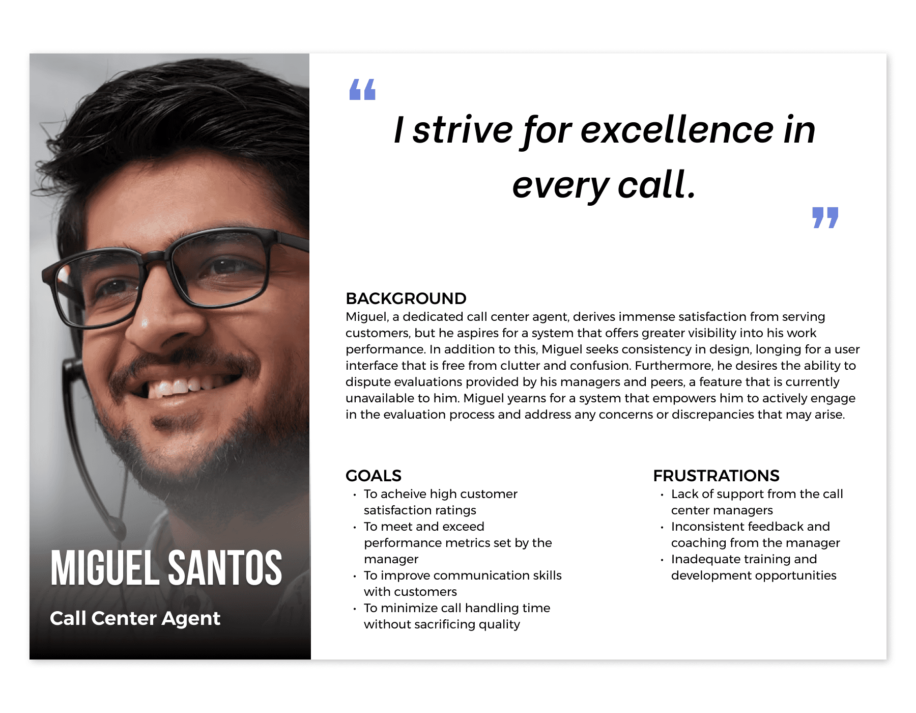
Persona:
Following the analysis of user research findings, the next step was to develop a persona, which aided in envisioning the intended audience. To facilitate the design process, I ensured that one particular persona effectively represented a call center agent who was enthusiastic about improving the workflow process, taking into account their pain points and frustrations.
This persona served as a constant reference point throughout the entirety of the product design journey, helping to maintain a clear focus when making design choices.
Sitemap:
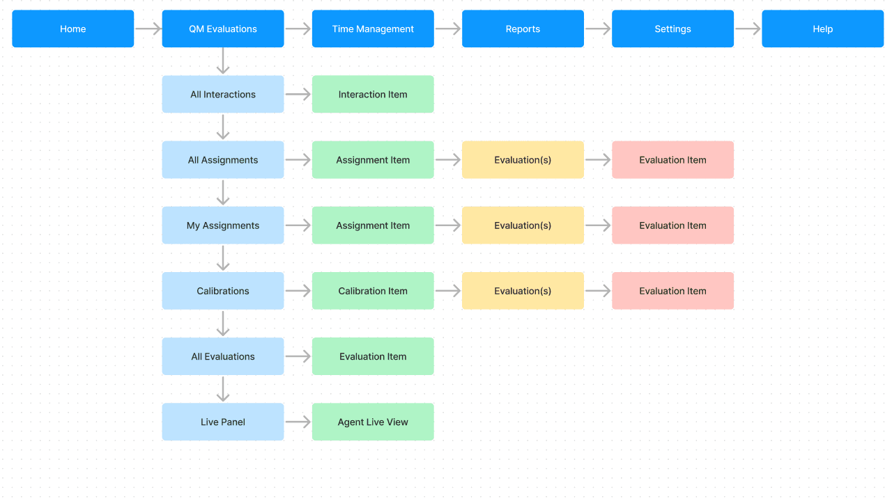
Afterward, the focus shifted towards conceptualizing the structure of the product mainly thinking about what the functions and main actions required at this particular part of the process.
Given this perspective, I prioritized the use of desktop computers, and tablet devices and proceeded to design a sitemap that visually depicted the primary user journey (for a manager) within the product.
Sketches:
At the onset of the design phase, I initiated the process by creating preliminary sketches outlining the desired page layout. My objective was to enable users to easily navigate between their personal interactions, evaluations, and statistics - without being able to access the information of thier colleagues, as that information was intended to be role and permission based.

Lofi:
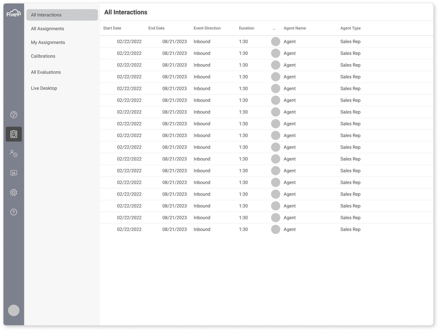
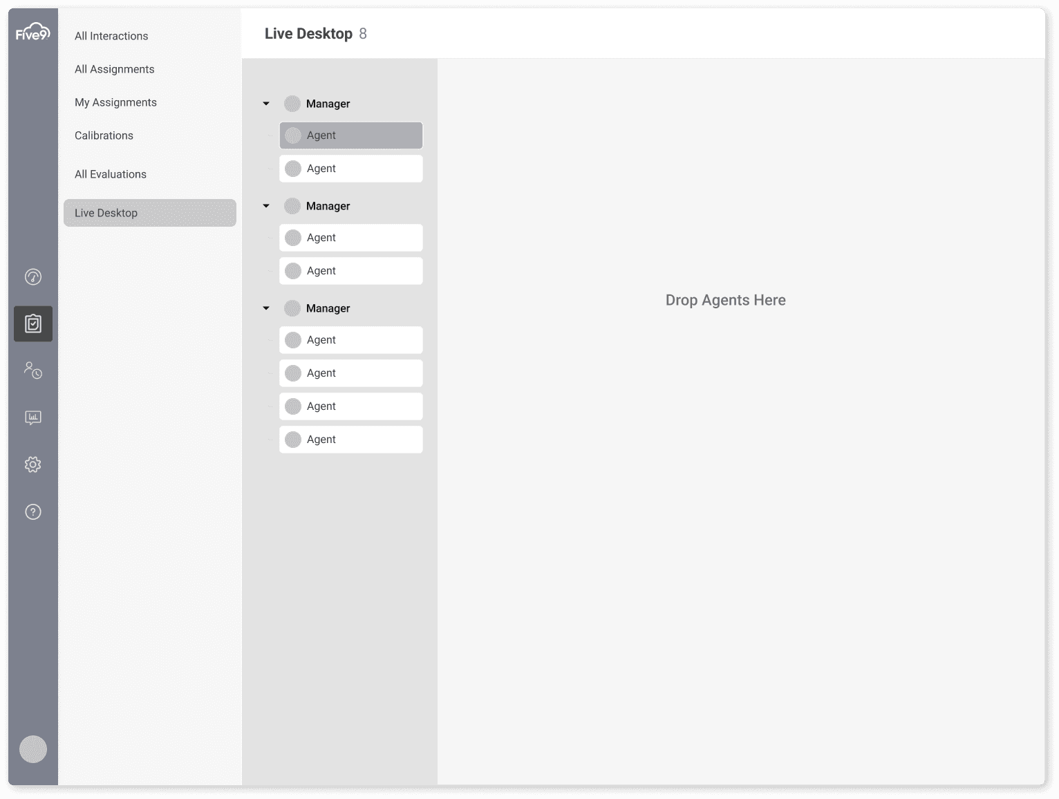
With the foundation of the website's structure in place, the next step involved crafting low-fidelity wireframes. These wireframes served as initial representations of each screen's layout and content. Subsequently, these wireframes were transformed into lo-fi prototypes, allowing for a rapid assessment of how the screens should seamlessly flow together.


User testing:
Before moving on to high-fidelity mockups, I tested some lo-fi views with some of the call center customers through the product owner in an unmoderated usability study. Here were some of the improvements made based on their feedback:
Users suggested adding more clarity to filter options at the grid/table view
Users stated that they wanted to control the content on the page (hide/reveal)
Users wanted to know where they were in the app at all times
Users wanted an easier way to perform evaluations and reviews of their performance.

Final design:
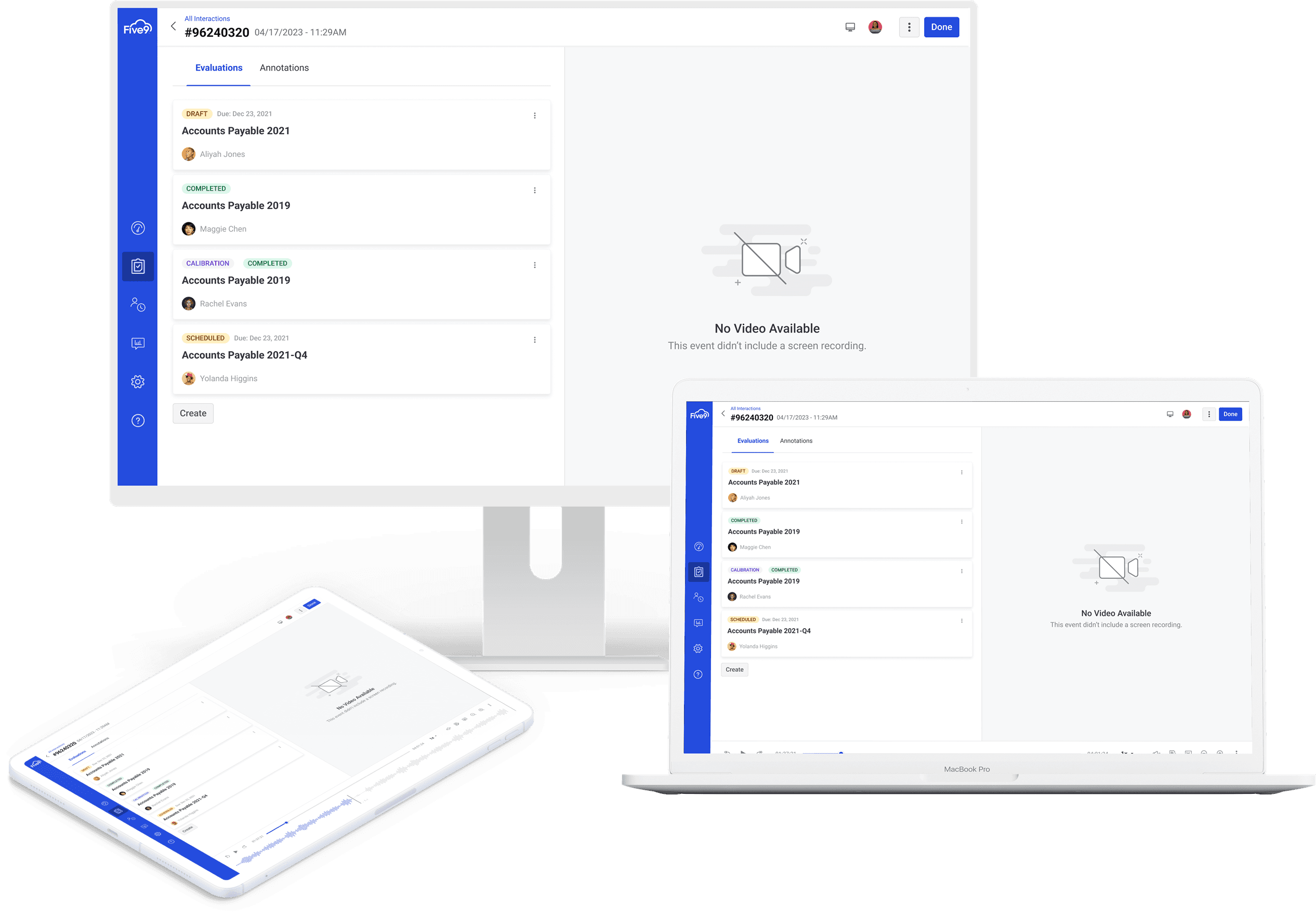
After taking into account the user feedback and iterating on the prototypes, the final design was complete. Due to the lack of insight into an agents own performance they felt powerless to their managers. But now, they really liked that they could better dispute their performance which allowed them to work with more confidence, and with an interface that was more consistent and flowed more logically.


Other Projects
© Copyright Kuality Design 2023. All rights Reserved.
© Copyright Kuality Design 2023. All rights Reserved.
© Copyright Kuality Design 2023. All rights Reserved.

